



Hello and welcome to the first That Looks Good, a round-up of creative stories and projects that have caught my eye over the past week.
Whether it’s a nice visual execution or something that’s tickled the creative part of my brain, I’ll be aiming to write it down and pull it together into a handful of stories – mainly so they don’t get lost to the void.
My plan is to try and keep up with these, as there are so many new projects and games coming to market that I feel spoilt for choice when it comes to seeing things that genuinely make me say, “that looks good” in my head.
So with that, let’s dive in…
Andrew Bosley's Smoking Bones universe takes flight with Braided Skies
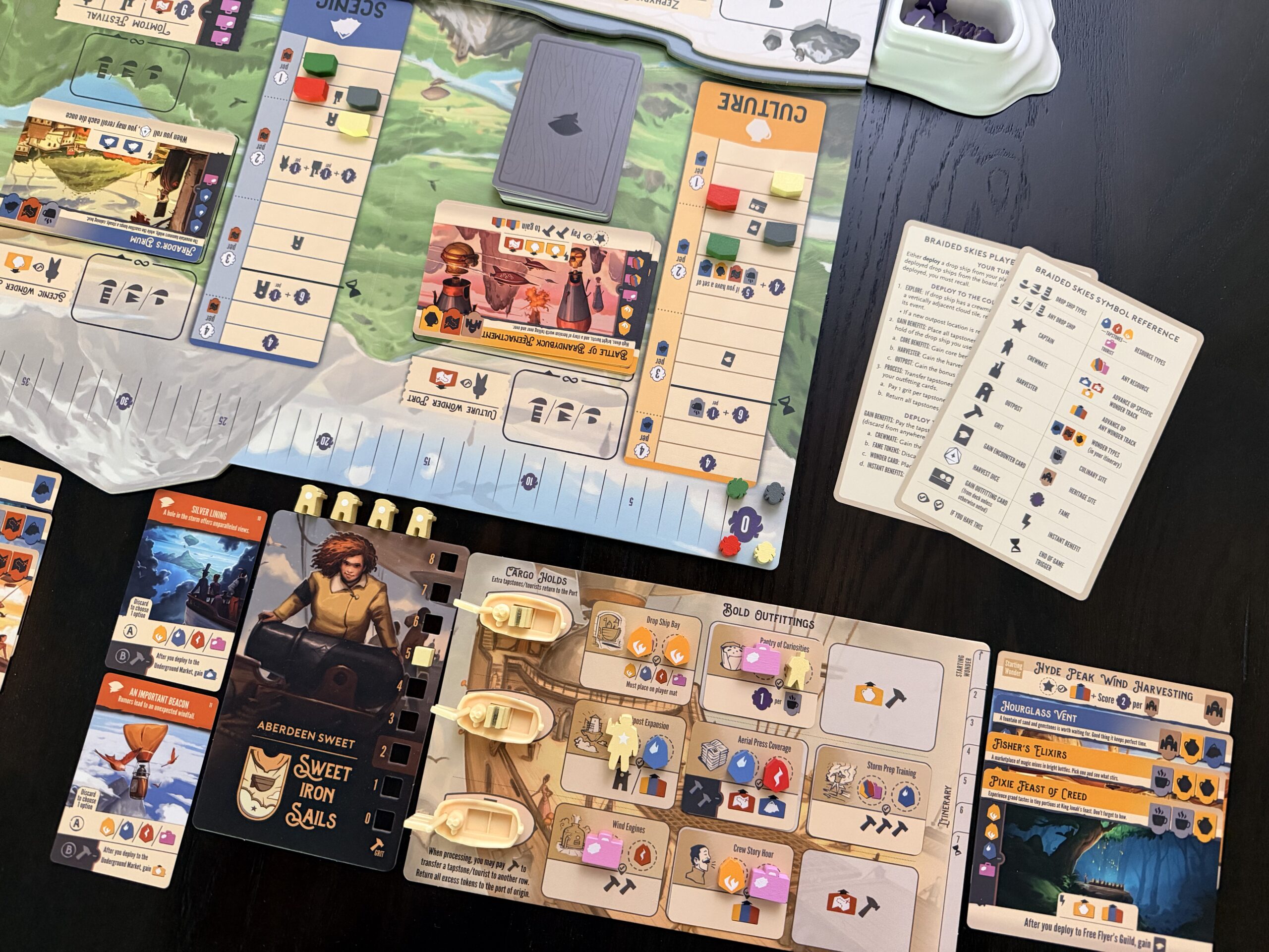
Last week saw the trailer for Braided Skies from Stonemaier Games released ahead of its launch this October. Braided Skies is a new fantasy strategy game designed by Dan Germain and illustrated by Andrew Bosley. More importantly, the game is the first tabletop title set within Smoking Bones, a fantasy universe created and illustrated by Bosley.
Players will gather at the table to take control of airship captains, taking to the skies to build magical travel companies across the Northlands, exploring new locations, transporting tourists and upgrading their operations. The production leans heavily into the world of Smoking Bones through the game’s components and boards, including triple-layered boards, stunning card art, distinct player mats and numerous elements that feel pulled straight out of Bosley’s world.
What pulled me in was seeing the project from a design and art direction perspective, because the visual world it’s based on predates the board game itself. Smoking Bones began life as Bosley’s own illustrated setting rather than a set of commissioned artworks crafted specifically for an existing title. Braided Skies creates an engaging relationship between illustration, world-building and product development: an established visual universe becoming the foundation for a new series of games.
Stonemaier itself has described Braided Skies as the first game in a wider Smoking Bones series, with the game’s launch currently planned for 14 October, and a wider English-language retail distribution later in November – it’s good to see that localisation is being prepped for multiple languages in the future too.
I’ positive the game will be a phenomenal success, and I’ll be keen to watch how such a distinctive, illustrator-led visual language is translated into other titles in the future – especially around how much of that identity can sit across multiple products. Personally, I can’t wait to see what else comes out of the Smoking Bones universe to join Braided Skies.
Sources
Against the Storm rebuilds from videogame to tabletop
Eremite Games and Mindclash Games have come together and announced a tabletop adaptation of Against the Storm, with a crowdfunding campaign scheduled to launch on Gamefound in May 2027.
Based on Eremite’s widely praised roguelite city-building video game, the tabletop version is being developed by Mindclash as a cooperative heavy Euro title. Players will build settlements, manage resources and work with seven different species while contending with the Blightstorm that defines the original game’s dark-fantasy setting.
Video game adaptations always present a particular design challenge, and I don’t think Against the Storm is any different. By the nature of the game itself, Against the Storm relies heavily on interface design, resource management, environmental storytelling and a recognisable cast of species. Translating those elements into a tabletop experience will need some thought to determine which parts of the video game’s visual language are essential to keeping the vibe of Against the Storm, and what needs to be reinterpreted for cards, boards, components and physical information.
You can already see glimpses of this translation in effect, with the wonderful-looking wooden meeples and some of the card artwork shown on the Gamefound page. Plus, the box art looks fantastic too.
The Gamefound campaign is still around eight months away, meaning the project has a long runway to build momentum before crowdfunding begins. The official Gamefound page is already accepting followers, giving Mindclash and Eremite plenty of opportunity to reveal more about the project and build an audience around it, both from video game fans and board gamers too.
It’ll be great to see where the project goes over the coming months. The progression from the first announcement through to the physical component reveals, how the crowdfunding campaign graphics and page turn out, and ultimately the packaging the game ends up in can give those who are into the visual side of things a great example of how a video game identity is translated into tabletop.
Sources
Itchy...tasty...Ink Ribbon brings survival-horror into a physical RPG
When I saw that Old Oak Games had launched crowdfunding for Ink Ribbon, a new tabletop RPG built around the mechanics of classic survival-horror video games, I needed to find out more.
Created by Emmet Byrne, whose previous work includes Warhammer Age of Sigmar: Soulbound and Broken Weave, Ink Ribbon wears its inspiration loudly, citing Resident Evil, Silent Hill and Alan Wake among the influences found in the title. The BackerKit campaign funded within 38 minutes of launch and had passed €100,000 against its original €25,000 target, with no sign of slowing down.
But rather than just using survival horror purely as a theme, Ink Ribbon aims to bring many of the genre’s familiar systems directly to the tabletop. Players explore the doomed city of Sparrow’s Rest while managing limited ammunition, healing items and inventory space, facing zombies and much more in the alleyways of the fallen city.
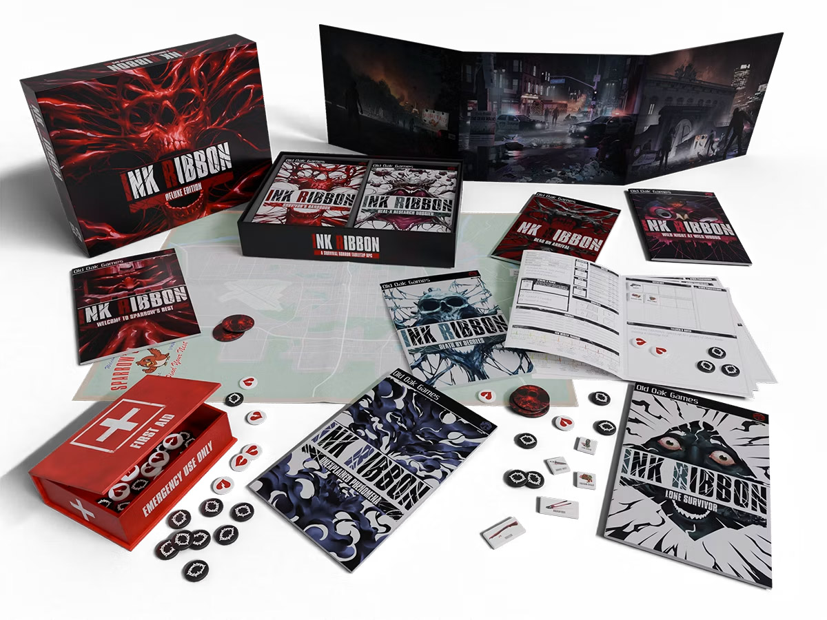
The campaign includes a city map recording events across groups of survivors, while the Deluxe edition introduces fantastic-looking physical item tokens that allow players to recreate the slot-style inventory management you’d find in games like Resident Evil (a lovely touch). Rules, scenarios and monster material are also divided between multiple zine-sized books, each with a nice nod to PS2 game packaging, rather than being consolidated into a single RPG rulebook.
These small design decisions add up to a package that sings to fans of survival horror from the 1990s especially. Ink Ribbon is deliberately recognisable as survival horror, but is free from the licences of any of the video games that inspired it. The Ink Ribbon team have needed to communicate the feel of those games through original illustration, typography, maps, physical assets and other recognisable graphic nods, rather than relying upon familiar characters or logos.
Old Oak Games has been clear to point out that the project uses entirely human-created artwork, with its illustration team including Álvaro Jiménez, Clara-Marie Morin, Siman Vlaisavljevi?, Eugenio Frosali and Findara McAvinchey – something that has become more prevalent in the tabletop world with so much AI content flooding the market.
Ink Ribbon is exciting to keep an eye on not just as an indie RPG campaign, but as a great example of genre recognition becoming its own visual identity – borrowing the language and styling of survival-horror games and making it its own.
Sources
Wyldwood brings back the stone age
Tabletop Titans has recently launched Wyldwood, a new miniatures skirmish game that brings together 60mm minis with card-driven tactical gameplay – all set within a Stone Age-inspired fantasy setting. As a nice break from the norm, Wyldwood moves away from presenting fantasy races at the height of their civilisations and instead reinterprets elves, dwarves, orcs and other factions as existing during the earliest period of their world.
Five factions form the initial range, each supported by its own characters, visual identity and play style. Players select five champions and construct a 30-card command deck, with cards replacing traditional dice rolls for attacks, actions, magic and defensive moves.
What stands out most on the tabletop is the game’s 60mm miniatures. Most wargames balance miniature detail against the practicalities of big armies on the battlefield. Wyldwood looks to move closer to the display-miniature end of the hobby, with each faction containing a comparatively small collection of large character models, versus the usual spread of squads, heroes and units.
What’s worth noting is that with fewer, larger characters, individual models can carry significantly more of the visual identity of each faction, while the accompanying cards provide another part of the game through which illustration and graphic design can establish that faction’s aesthetic. The sculpts clearly look imposing and full of detail on the table, but I’m personally drawn to the visuals on the cards – which draw you in with tonal illustration and considered elements throughout.
And it’s clear that Tabletop Titans has put a lot of love and effort into the visual direction of the game. Originally establishing itself through miniature-wargaming content, the team has taken revenue from its Titans Terrain project and moved it into the development of Wyldwood – an investment that has covered modelling, artwork, world-building and gameplay development.
With factory prototyping reportedly already completed ahead of crowdfunding, it’ll be great to see where Wyldwood goes, both as a new miniature IP and as an example of how Tabletop Titans moves from a media and community brand to a tabletop publisher.
Sources
Did you put one of the new cover sheets on your TPS report?
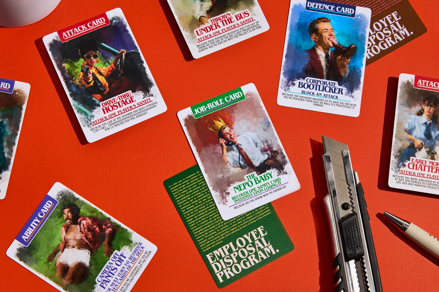
I’m ending this week’s post with the brilliant Employee Disposal Program, which caught my eye initially from the card artwork and had me pre-ordering when I learned more about the game.
Pleiades Interactive is gearing up Employee Disposal Program for a retail release following its successful Kickstarter campaign, which attracted 3,594 backers and AU$200,682 in funding, smashing its original AU$3,000 target.
At its heart, Employee Disposal Program is a party game inspired by the frustrations of modern corporate life, turning office politics, pointless meetings, passive-aggressive emails and workplace jargon into a competitive card game. Players begin with a limited amount of sanity and attempt to survive the workplace while using action cards to throw their colleagues under the bus.
The game’s theme extends beyond its mechanics and into its wider style. Corporate language is repurposed throughout the game’s visual identity, while individual cards include fantastic artwork from Zayane, complemented by sharp and very funny flavour text. The result is a game built around the visual and verbal language of the worst of office culture, rather than a traditional goblins-and-castles setting.
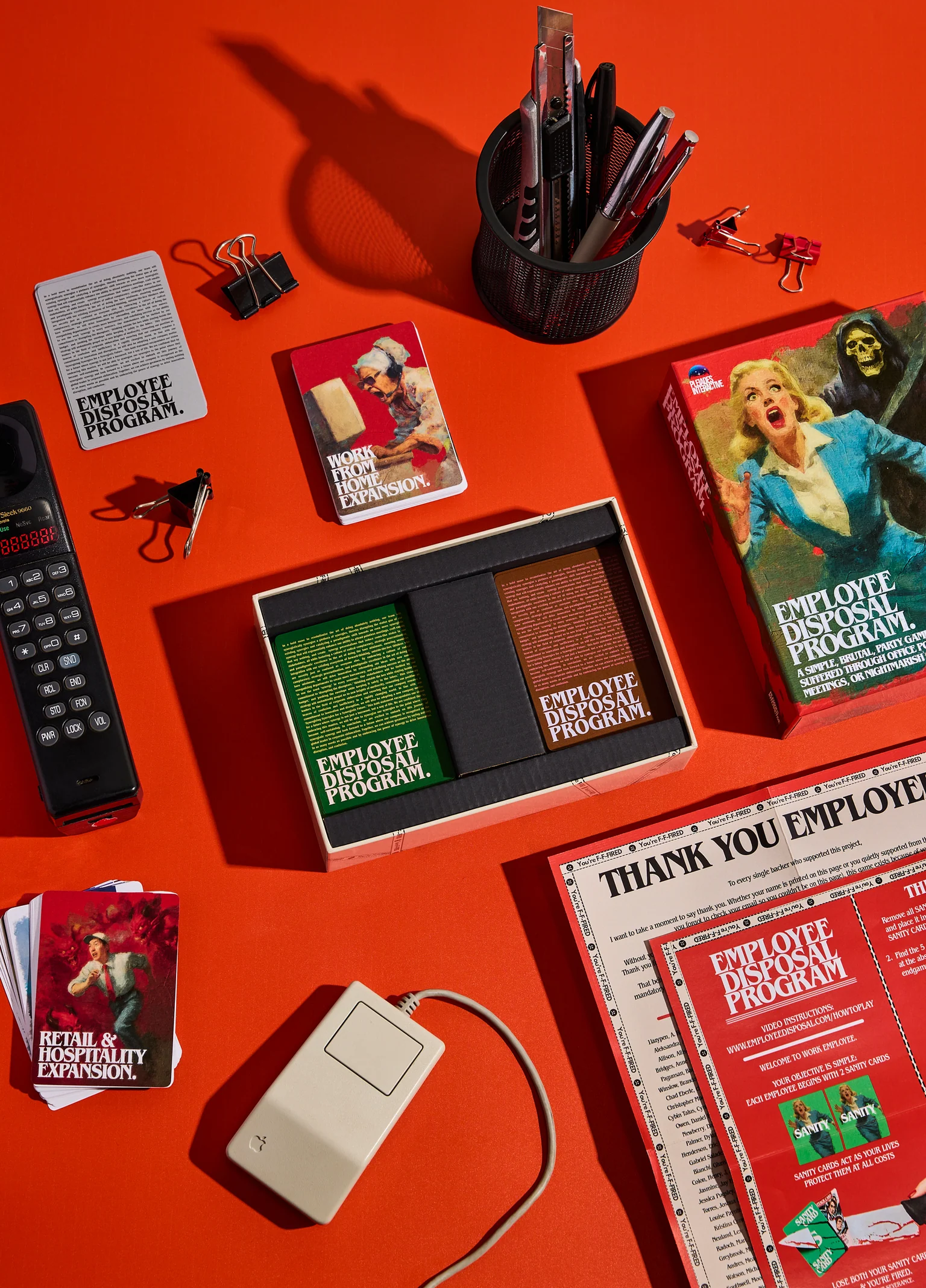
It’s this highly focused and depressingly accurate visual identity that takes recognisable elements of corporate communication – office documentation, warning graphics, HR terminology and deliberately bureaucratic presentation slides – and blows them out into a coherent and miserably relatable tabletop aesthetic. Instead of illustration being used primarily to establish a fictional world, the artwork and design system itself does much of the world-building.
That vibe also gives the game an immediately understandable baseline. Before learning how it plays, the title, packaging, card treatments and copy give away what kind of experience you’re in for. The mundane visual language of workplace bureaucracy effectively becomes the game’s “fantasy dungeon” setting.
Employee Disposal Program really is worth taking a look at as an example of pinpoint, concept-led art direction: the theme isn’t just the artwork on the cards, but a direction that runs consistently through the game’s naming, typography, graphic language, copywriting and physical presentation.
So that’s the end of the first That Looks Good round-up. I hope people found it useful!
I plan on writing more of these at the end of each week. There’s so much going on in the world of tabletop design that I want to make sure I remember to write down and share what I see – or at least what catches my eye.
Until then, have a good one!
